Electronic Charts
Like it or not, printed nautical charts are on their way out, as more and more sailors turn exclusively to the electronic equivalents displayed on their plotters, PCs, and a growing mélange of smart phones and tablets. Now, please: Retorts about how one must always carry paper charts, at least for backup, are unnecessary. I’m just reporting what I see, and don’t see, on boats these days, and besides, I love paper charts. I believe that the charts most of us grew up with mark a zenith point in a long struggle by mariners to organize hard-earned data into an amazingly rich, even artful, graphic form. I can’t throw old paper charts away.
Electronic charts, on the other hand, have only been evolving for a few decades, not centuries, and their zenith may not even be on the horizon yet. But their core advantage—the ability to constantly and automatically plot your GPS position relative to charted and overlaid dangers—is extremely compelling. Consider, for example, that many cruisers in areas with poor official charting, like the San Blas islands, have taken to scanning guidebook sketch charts (which contain lat and long information at their corners) into charting programs such as SeaClear that, when connected to a GPS, can put a boat right on the chartlet and thus bypass the bother, and potential mistakes, of plotting guide waypoints manually.
Electronic charts can already be richer in data than printed charts—sometimes too rich—and eventually they’ll be even more intuitive, I trust, and maybe even better looking. But today they can be confusing in ways that lead to embarrassments or worse, and a good navigator, defined, in part, as a person with a slightly paranoid “What could be wrong here?” mindset, spends some time questioning the ones they use. Just where did this data come from? How current is it? Am I seeing all the critical information, and could I see it better? Are distances obvious? And what the heck is the underlying detail scale, anyway?
Getting a good feel for relative distances and data detail was relatively easy with paper charts, at least once you got used to the scale conventions of ocean, coastal, and harbor charts. And that knowledge, even if muddled a bit by such reprint books as ChartKits, which often mess with scales to make pages fit, can help you understand electronic charts better. That’s because nearly all the core navigation data you’ll see on the many current electronic-chart formats is sourced from the same place as the paper charts, often just traced off them. So while your display may let you zoom way in on a coastal complication, in all likelihood, you’ll see only the amount of detail a cartographer could fit on the largest-scale (showing the smallest area) paper chart for that area. That can vary a great deal between, say, a fairly infrequent 1:10,000 harbor chart and one designed at the common 1:40,000 coastal scale.
There are some interesting exceptions to that general concept, like the ultra-large scale C-Marina detail that Jeppesen C-Map folds into its electronic charts and the similarly high-resolution Corps of Engineers project data I sometimes detect in various manufacturers’ products. And sailors shouldn’t ignore the separate “fishing charts” now often bundled into digital cartography; it’s not official bathymetric data, but it’s often fresher than what is. For the most part, though, what you see on an electronic chart, aside from the sometimes useful extra data, like shoreside point-of-interest info, is simply a graphic reinterpretation of what’s drawn on the equivalent paper chart.
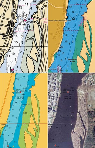
“Reinterpretation” is a key word. Electronic charts are “smart” in many ways, able to turn text and spot soundings head up, for instance, or to highlight depths that you specify as dangerous. But the image is drawn by computer algorithms, which aren’t yet as wise as human cartographers. Text sometimes obscures more important information, while some zoom levels may be too cluttered, some too simplified. And the process of turning human-drawn chart symbols into rigidly categorized database items doesn’t always work well. There are instances in which even NOAA’s Electronic Navigation Charts seem to de-emphasize hazards copied from its own paper charts (see the charts on page 97), and the problem gets compounded because the private chart makers are beginning to use ENCs as source data.
I don’t want to overemphasize the shortcomings of electronic charts, but these are some of the reasons you shouldn’t take them at face value. (See “Make the Most of Your Electronic Charts” on page 100 for advice on how to overcome particular scale and presentation issues on your display.) So realize that one very smart aspect of electronic charts is how they can be customized to meet your preferences. This varies greatly among chart and display developers, but it’s worth your time to dig into manuals and submenus to see what choices you have in terms of safety soundings, point-of-interest display, nav-aid symbols, and so forth.
One significant exception to chart smarts, and to many of my cautions thus far, is the type of electronic chart called rasters, which NOAA terms Raster Navigation Charts, or RNCs for short. These are simply digital scans of paper charts, like digital photographs, and while they include the native intelligence of the people who drew them, they are dumb in the sense that all other electronic cartography, called vector charts, are databases of infinite size that are “drawn” on the fly.
But raster and vector electronic charts are similar in the sense that they always look fresh and up to date, even when they aren’t. Paper charts had a natural way of telling you when they needed replacement. Such organizations as BoatU.S. and the Power Squadron are beginning to see the perpetual fresh appearance of electronic charts as a problem. Their new Alliance for Safe Navigation aims to make boaters more aware of chart updating and provide some useful online tools. Check them out online (www.allianceforsafenavigation.org), and also check into the age and update process for your electronic charts.
Let’s take a quick look at the various flavors of digital cartography available today. It’s become standard for multifunction displays to come with embedded charts and the option to add more data features and/or other vector formats. Garmin, for instance, offers built-in BlueChart g2 charts along with Vision cards that add photo maps, advanced 3D, and more. Raymarine embeds Navionics Gold data and can display full-featured Platinum as well. Lowrance and Simrad can also display Platinum, but have their own Insight charts for the United States. C-Map Max charts are seen on plotters from Standard Horizon, Interphase, and Si-Tex; the Pro version in Nobeltec charting programs, which, like most PC nav programs, can also display the rasters available free from NOAA or for a fee from other hydrographic offices (usually found through third parties).
Furuno took a novel approach with NavNet 3D by embedding both NOAA RNCs and ENCs, all processed by sister company MapMedia, which also produces foreign charts. This was a boon to paper-chart lovers but also a lesson in scale issues, as NOAA’s ENC portfolio is incomplete, resulting in some holes and anomalies. Furuno has recently fixed this situation by offering core C-Map vector data for the United States and has gone a step further by offering both Navionics and C-Map data for some foreign regions. The advantage of this is particularly vivid in the Bahamas, where the surveying and data licensing were done by various overlapping private parties: Around some islands, MapMedia C-Map is much more detailed than MapMedia Navionics, and vice versa. Note, though, that MapMedia charts don’t include the added data features that those two companies include on their own cards. But the choice of using both complete Navionics Platinum or the new C-Map 4D packages will come to the States when Geonav debuts its multifunction displays this fall.
Just which electronic-chart maker has compiled the best official data for foreign waters is an ongoing debate among bluewater cruisers and a moving target, but my experience is that all the vector formats for the States cover the official core data well. The real issues are the ones discussed above, plus all the optional data and display features, such as 3D, which is moving quickly from novelty to valuable, I think. I’m cruising with, and blogging about, all manner of electronic charts this season; CW’s November issue will carry my recap. I’m sure the charts will serve me well, if I use them carefully, but I’ll miss the pencil scribbles and coffee-cup stains that mark past voyages on all the old paper charts in my basement.
Ben Ellison is CW_’s electronics editor._